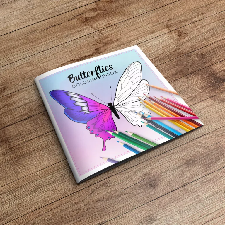
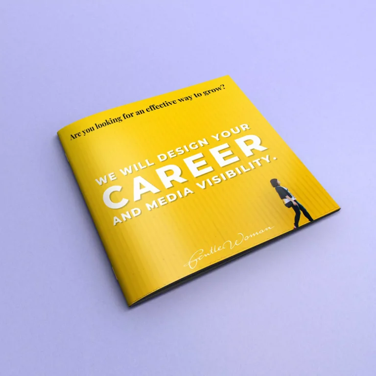
Magazine covers are the front pages of magazines, serving as the first point of contact between the publication and potential readers. They play a crucial role in attracting attention, conveying the magazine’s content, and enticing readers to pick it up. A well-designed cover can significantly impact a magazine’s success, making it essential to focus on its design and presentation.
The Importance of Graphic Design in Magazine Covers
A well-designed magazine cover is not only visually appealing but also effectively communicates the essence of the magazine’s content. Here are key aspects of effective graphic design for magazine covers:
1. Eye-Catching Title and Headlines: The magazine’s title and cover headlines should be prominent and engaging. They need to capture the reader’s attention quickly and clearly convey the magazine’s theme or main stories.
2. Compelling Imagery: High-quality images or illustrations are essential for a striking cover. The main image should be relevant to the cover story or theme and should evoke curiosity or emotion in the viewer.
3. Brand Identity: The cover should reflect the magazine’s brand identity consistently. This includes using the magazine’s logo, color scheme, and typography that align with its overall branding.
4. Balance and Composition: The layout of the cover should be well-balanced, with a harmonious arrangement of text, images, and white space. Good composition ensures that the cover is not cluttered and that all elements are easy to read and visually appealing.
Designing a Magazine Cover
Designing a magazine cover involves several key stages, with a strong focus on graphics:
1. Concept Development: Start by brainstorming and developing concepts that align with the magazine’s theme and content for the issue. Consider the target audience and what will appeal to them.
2. Image Selection or Creation: Choose or create high-quality images or illustrations that will serve as the main visual element of the cover. Ensure that the image is relevant, compelling, and of high resolution.
3. Typography: Select fonts that are readable and match the magazine’s style. Use a hierarchy of typography to highlight the magazine title, headlines, and subheadings. Experiment with different font sizes, weights, and styles to find the best combination.
4. Color Scheme: Choose a color scheme that complements the cover image and reflects the magazine’s brand identity. Colors should be used strategically to highlight important elements and create visual interest.
5. Layout and Composition: Arrange the elements on the cover in a way that is balanced and visually pleasing. Pay attention to the alignment, spacing, and proportions of text and images. Ensure that key elements are prominently placed and easy to read.
Finalizing a High-Quality Magazine Cover
The process of finalizing a magazine cover involves several essential steps:
1. Proofreading and Editing: Check all text on the cover for spelling, grammar, and punctuation errors. Ensure that all headlines and subheadings are clear and accurately reflect the content inside the magazine.
2. Feedback and Revisions: Seek feedback from colleagues, editors, or focus groups. Use their input to make necessary adjustments and improvements to the cover design.
3. Print-Ready Preparation: Prepare the cover for printing by ensuring that the file is in the correct format (typically CMYK for print), with appropriate resolution (at least 300 DPI), and includes bleed areas if necessary.
4. Test Prints: Conduct test prints to check color accuracy, image quality, and overall appearance. Make any necessary adjustments based on the test prints to ensure the final product is of the highest quality.
5. Final Approval: Obtain final approval from all relevant stakeholders before sending the cover to print. This ensures that everyone is satisfied with the design and that there are no last-minute changes needed.
Conclusion
Designing, composing, and finalizing a magazine cover is a meticulous process that requires attention to detail and a strong focus on graphic design. By emphasizing eye-catching titles, compelling imagery, consistent branding, and balanced composition, you can create a magazine cover that not only attracts readers but also effectively communicates the magazine’s content. Through careful planning and execution at each stage, you can ensure that your magazine cover stands out on the shelves and contributes to the publication’s overall success.


